When to Turn an Image to Black and White

Black and white images are classic! I always include black and white versions in my packages. Sometimes changing an image is a gut feeling for me, and at other times I visualize it first in black and white.  There are good reasons to try it out, and here are some of the things I consider when converting an image to black and white. 

Contrast

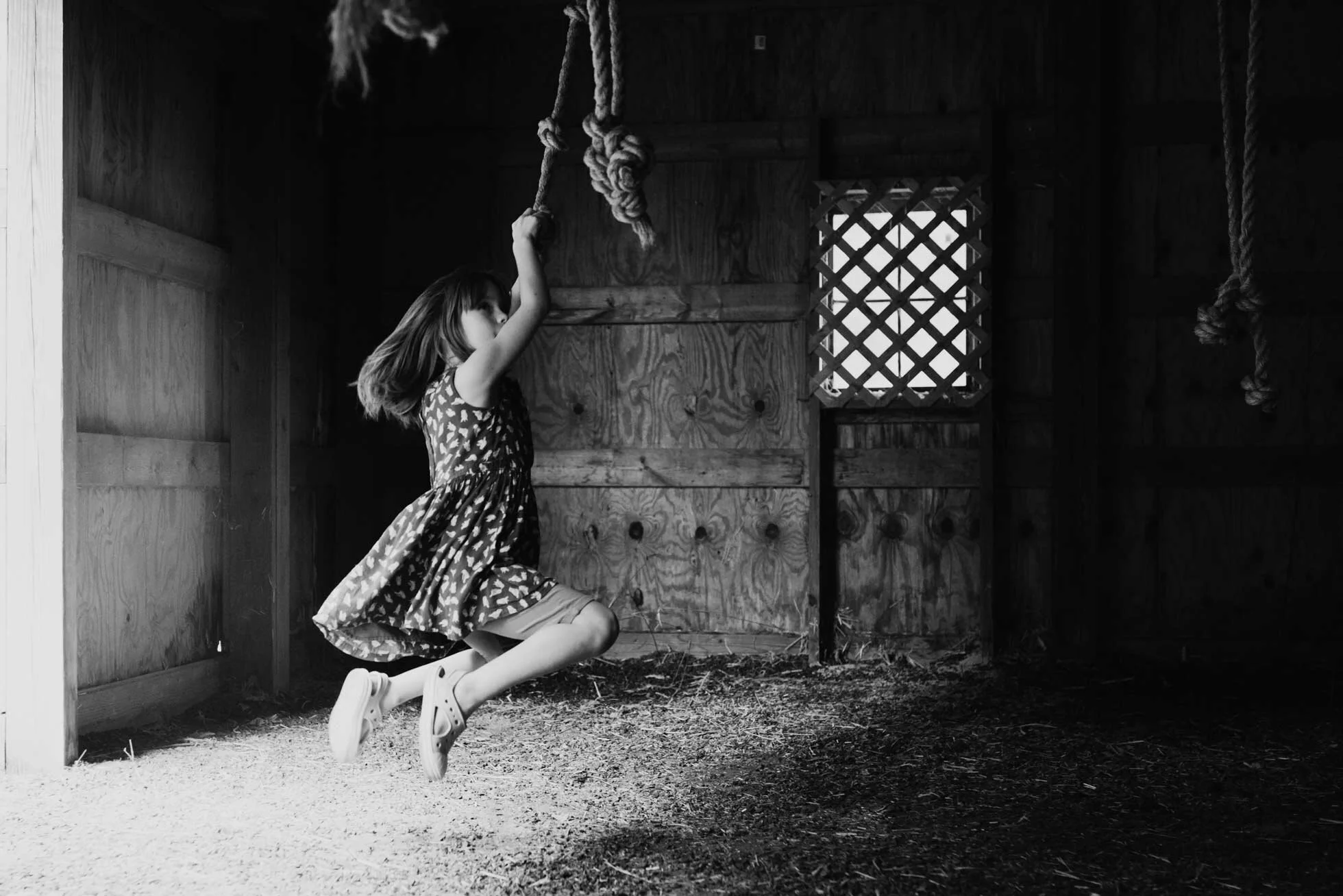
Light plays a huge part in creating depth to your black and white photo.  Having a strong contrast can help your image come to life rather than staying flat. I always increase my contrast when working in black and white.  If you are shooting in hard light, or very high or low-key light, black and white might be a good option.

kid swinging, columbus indiana photographer

Simplify

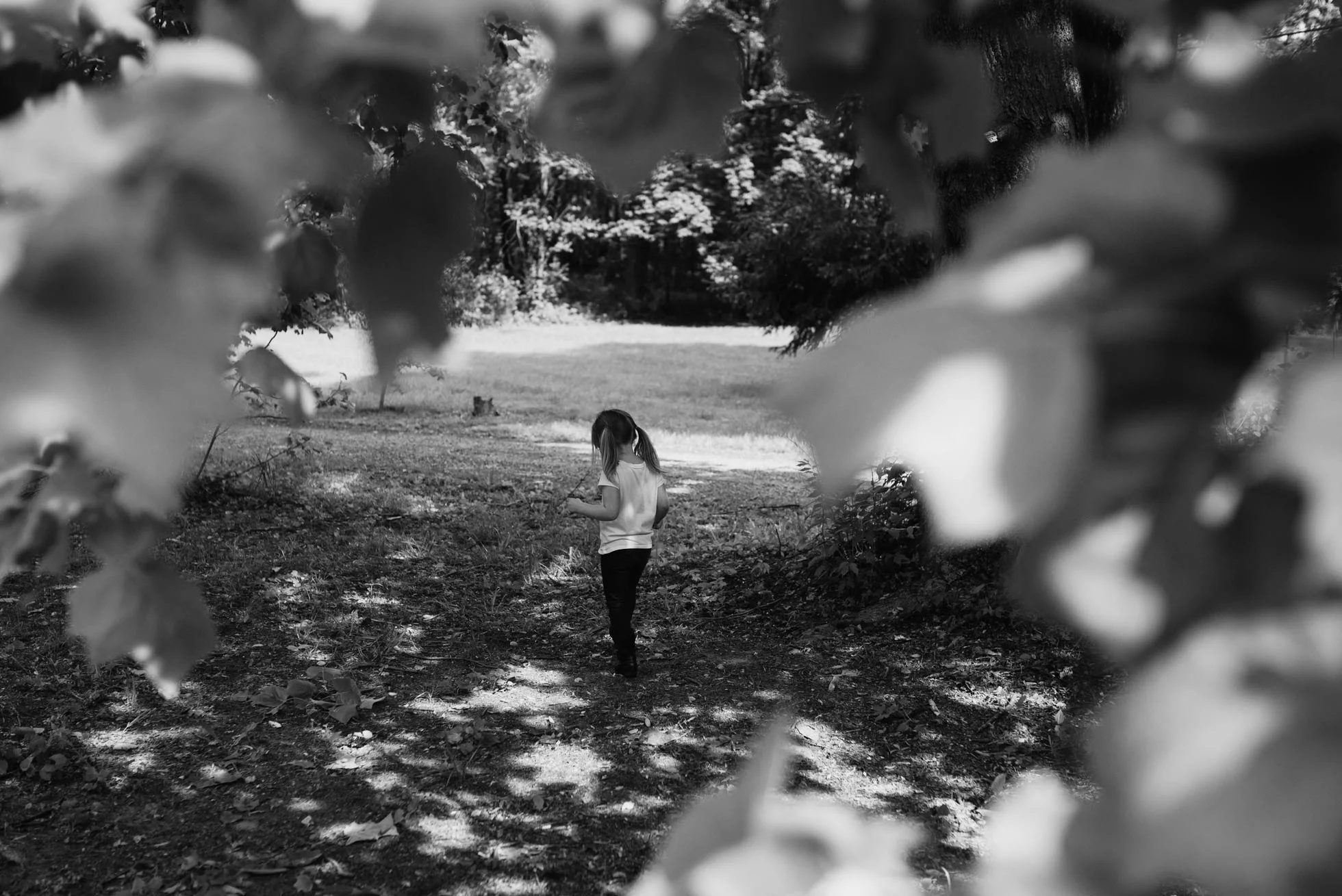
Sometimes you want your focus to be on your subject, but you’ve had a hard time separating them from your background.  In this case it may be a good option to convert to a black and white image.  Changing to black and white can simplify your image and make your point of view easier to understand.  Sometimes the color is just not that interesting, especially if your children are wearing neon! A conversion can really help that situation.

kid in park exploring, columbus indiana photographer, callihan photography

Mood

You can help make an image feel more dramatic and moodier by converting it to black and white. Someone who I think does this really well is Helen Whittle.  She takes images of children and emphasizes their mood and feelings in a way that is just so phenomenal. Lee Jeffries takes photos of homeless people and his black and white images have a very powerful and dramatic feel.  Black and white images are also very timeless.    

black and white noir photo, Columbus Indiana photographer, Callihan photography

Light

A way to really showcase light and texture is by converting it to black and white. Clipping your blacks intentionally will also help add depth.  With hard light color casts can be difficult to deal with. Sometimes it is too hard to get rid of color casts, but you can save a photo by converting it to black and white.  You should try your best to take care of those things first in Photoshop. Correct your white balance and then convert it to see if perhaps it looks better in black and white. This might save you some time.  

child with sparkler, Columbus, Indiana photographers, Callihan photography

Thanks so much for reading!


How to Add Fireflies to A Photo

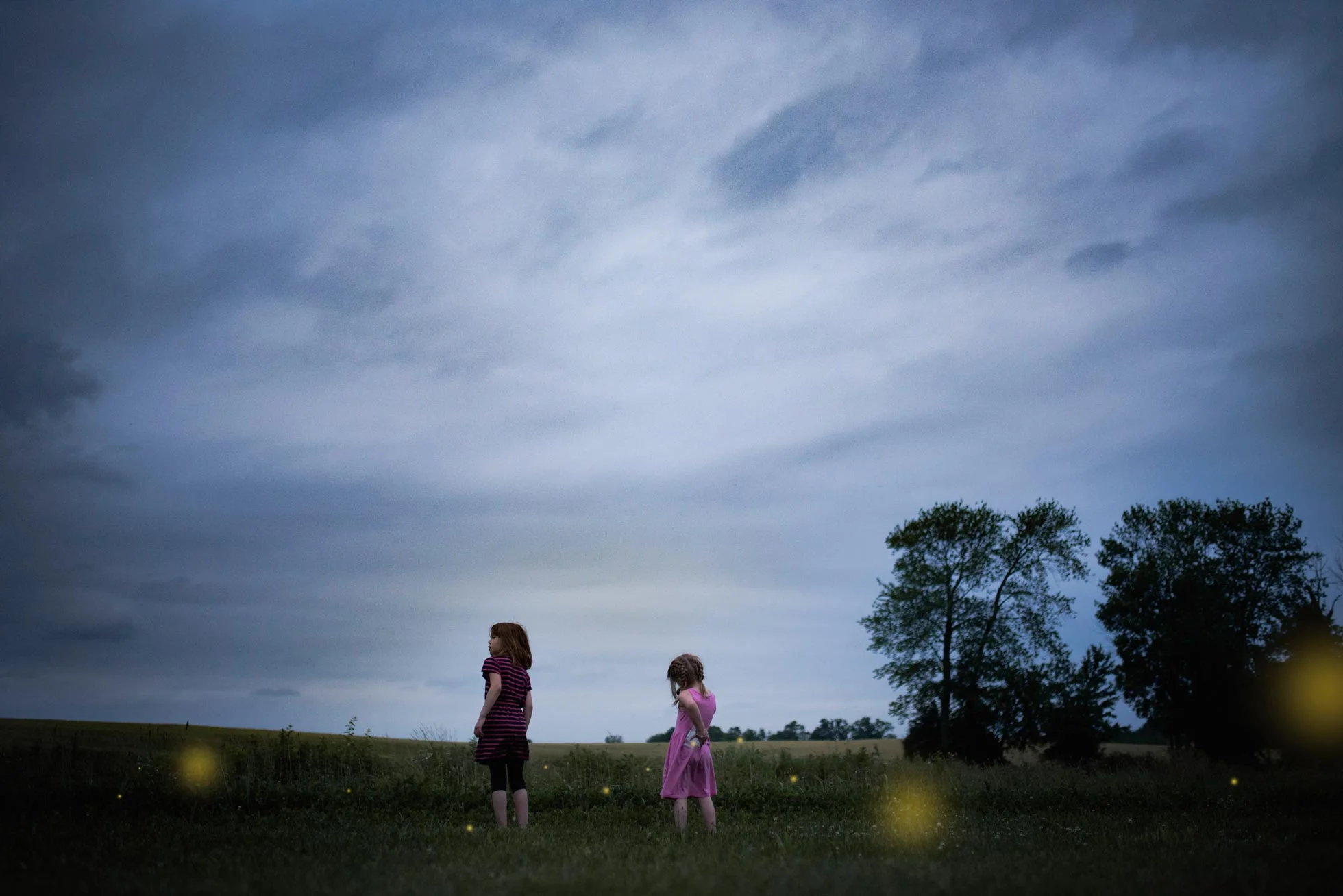
Fireflies, lightning bugs, bioluminescent creatures of the night, (whatever you call them): they are fascinating creatures to catch and watch. Not to mention it is a staple of childhood! I remember staying up late and catching them as a child, and I love to watch my kids as they chase them all over the yard.  We used a pickle jar, and punched holes in the top of the lid.  It is easiest to catch them when they land on the ground!  They are hard to see, which is also part of the fun of catching them.  If you live in the Midwest, this is a MUST!  

Firefly catching, Columbus, Indiana, child photographer

However, in pictures they just don’t show up so well.  Not to mention it is not that easy to snap a shot when they are all lighting up.  In order to make that picture as magical as it is for your child you will need an overlay! That is how I have created these pictures. I used an overlay in photoshop and set the layer to SCREEN.

Columbus, IN photographer tutorial example

Then I hit ctrl/j to duplicate the layer as much as I want.  I use the shortcut ctrl/t to transform and adjust the size. Then I place them in varying areas and sizes to add depth and atmosphere. The closer they are to your camera the bigger and blurrier you will need to make them.  I have created my own shortcut in photoshop to add a Gaussian blur.  But you can get there by going to filter>blur> Gaussian blur, and then blur to your taste.  I also lowered the opacity on some to make them blend better.

Columbus, IN photographer, example for Gaussian Blur

Remember the rule of odds if you place them close together or in the jar. To read more about the rule of odds, go here. This adds visual interest and helps to move your eyes throughout the picture. 

Fireflies in the pickle jar, Columbus, Indiana, Midwest picture ideas

I have made this overlay available for download for free! I added some noise to the overlay, because chances are if you are out catching lightning bugs it is going to be very low light. I had to increase my ISO to a very high number in order to capture anything and keep my shutter speed reasonable. Make sure to set the overlay to SCREEN. I hope you enjoy it! Please let me know if you do! Please share your pictures with me!  I would love to see what everyone comes up with!


Download the Firefly overlay here.

Lightning bugs, Columbus, Indiana Family Photographer

Thanks for reading!


10 Elements of Composition for Photography

  1.      The Rule of Thirds

    This one is a simple one to employ. If you divide your frame into 9 equal squares, then you should place your subject on the lines of intersection.  Horizons should go on these lines as well and you should avoid placing them directly in the middle (in between the lines).  This will help to add interest in your image.

Rule of thirds, photography composition tutorial, Columbus, IN

2.      Symmetry

It helps a strong center composition to have perfect symmetry on either side of your subject.  If you have ever watched a Wes Anderson film, you will notice how he uses this often. See here. This is one of my favorite compositions to use.  I feel like it brings a sense of whimsy and peace to the image. Symmetry is very pleasing to the eye.

Symmetry, elements of composition, Columbus Indiana photographer

3.     Negative Space

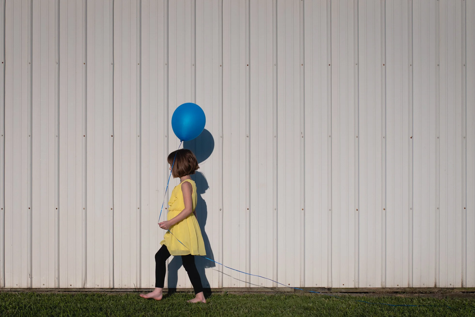
Having a lot of negative space around your subject helps to draw attention to them in a minimalist way. There are no distractions to draw the eye away with this composition.

negative space, rules of composition, Columbus Indiana photographer

4.      The Golden Triangle

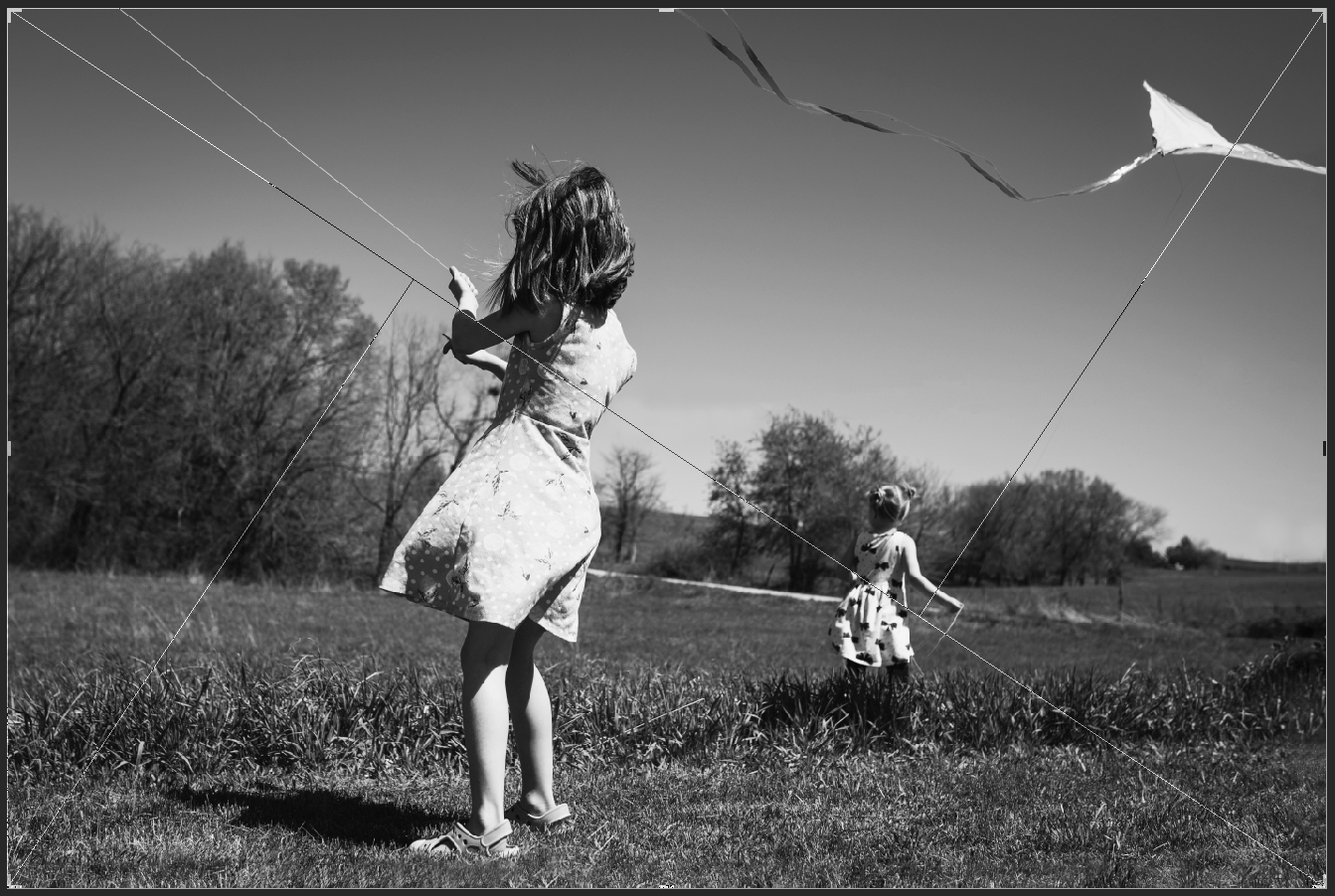
This one takes a bit of intention to pull off.  Be aware of strong diagonals going throughout the image.  Sometimes they are more implied.  Other times it is a direct line.              

Golden triangle example, Columbus Indiana photographer, rules of composition tutorial

5.     Isolate the Subject

Using a wide aperture as low as f/1.4 will help the focus to fall on your subject and the background will fade away into a blur. This will give you a shallow depth of field.  This gives a dreamier effect and is great for portraiture.

Isolate the subject example, elements of composition, Columbus, Indiana photographer

6.       Color

Using analogous colors or complimentary colors will help bring attention to your subject.  For this picture the girl’s hoodie is the same color as the lemur’s eyes. Color harmonies are also very pleasing.  I love using the primary colors!

color example, rules of composition, tutorial, Columbus, IN photographer

7.    Fill the frame

This is where you get very close to your subject so that very little if any space is seen around them. This draws the attention right to your subject.  Cropping in very tightly works well for this, just make sure to not chop limbs in an unpleasing way.  For more information on limb chops go here.

Fill the frame, composition element, Columbus, Indiana Photographer

8.      Leading lines

This is exactly how it sounds.  Look for lines or paths that will lead your eyes to the subject. You want these lines to take your eyes deeper into the frame. They do not have to be straight, sometimes a curved path can take you deeper into the image.

Leading Lines example, Columbus, IN Photographer, Tutorial

9.      Foreground and Depth

This is essentially layering.  Having a strong foreground, middle ground and background can help add visual interest. In this picture the plant is the foreground, the baby is the middle ground and the grandmother is the background.

Foreground and depth, Composition example, Columbus, Indiana Photographer

10.      Framing

This one is my favorite! I love shooting through things to frame my subject.  In this case the leaves do the job.  But you can use anything! People, nature, buildings, even light! The possibilities are endless.

Framing example, Columbus, IN photographer, composition rules

Hope this is helpful! If you’ll like, you can read more here. Thanks for reading.