10 Elements of Composition for Photography

  1.      The Rule of Thirds

    This one is a simple one to employ. If you divide your frame into 9 equal squares, then you should place your subject on the lines of intersection.  Horizons should go on these lines as well and you should avoid placing them directly in the middle (in between the lines).  This will help to add interest in your image.

Rule of thirds, photography composition tutorial, Columbus, IN

2.      Symmetry

It helps a strong center composition to have perfect symmetry on either side of your subject.  If you have ever watched a Wes Anderson film, you will notice how he uses this often. See here. This is one of my favorite compositions to use.  I feel like it brings a sense of whimsy and peace to the image. Symmetry is very pleasing to the eye.

Symmetry, elements of composition, Columbus Indiana photographer

3.     Negative Space

Having a lot of negative space around your subject helps to draw attention to them in a minimalist way. There are no distractions to draw the eye away with this composition.

negative space, rules of composition, Columbus Indiana photographer

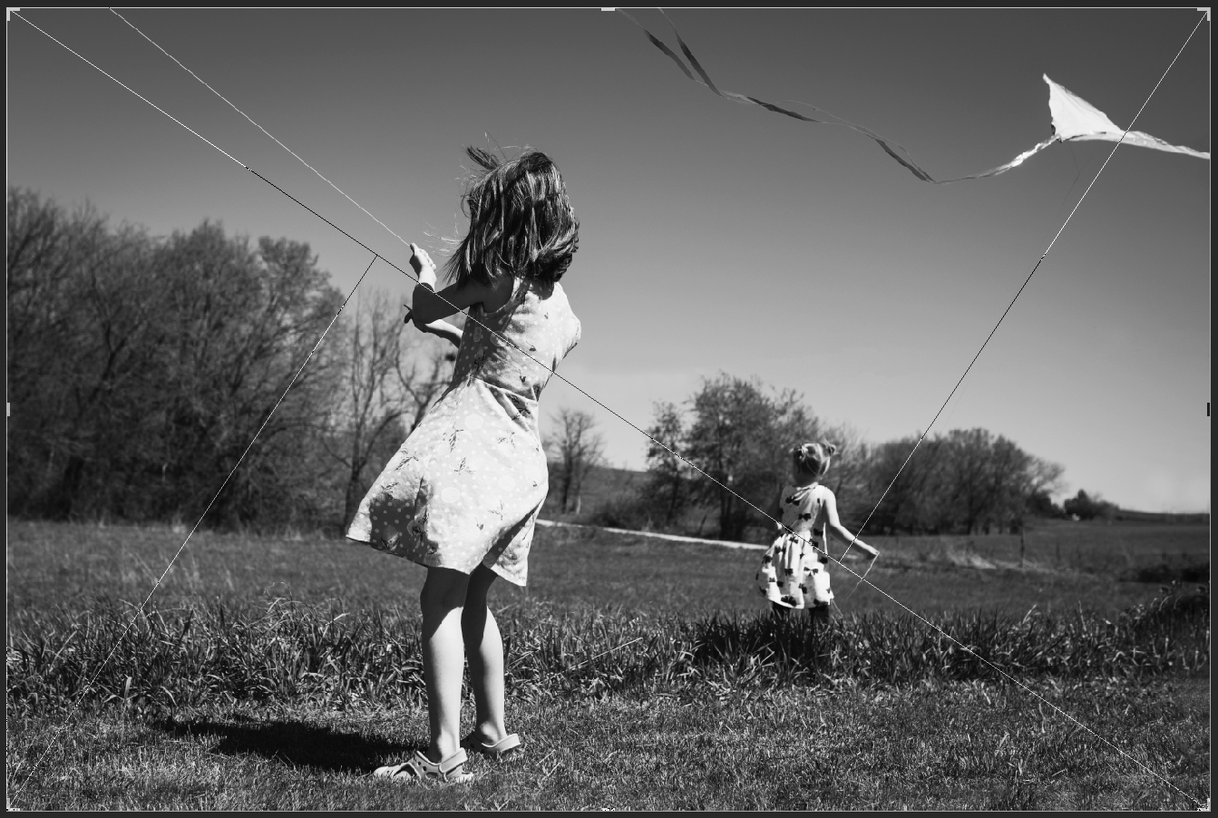
4.      The Golden Triangle

This one takes a bit of intention to pull off.  Be aware of strong diagonals going throughout the image.  Sometimes they are more implied.  Other times it is a direct line.              

Golden triangle example, Columbus Indiana photographer, rules of composition tutorial

5.     Isolate the Subject

Using a wide aperture as low as f/1.4 will help the focus to fall on your subject and the background will fade away into a blur. This will give you a shallow depth of field.  This gives a dreamier effect and is great for portraiture.
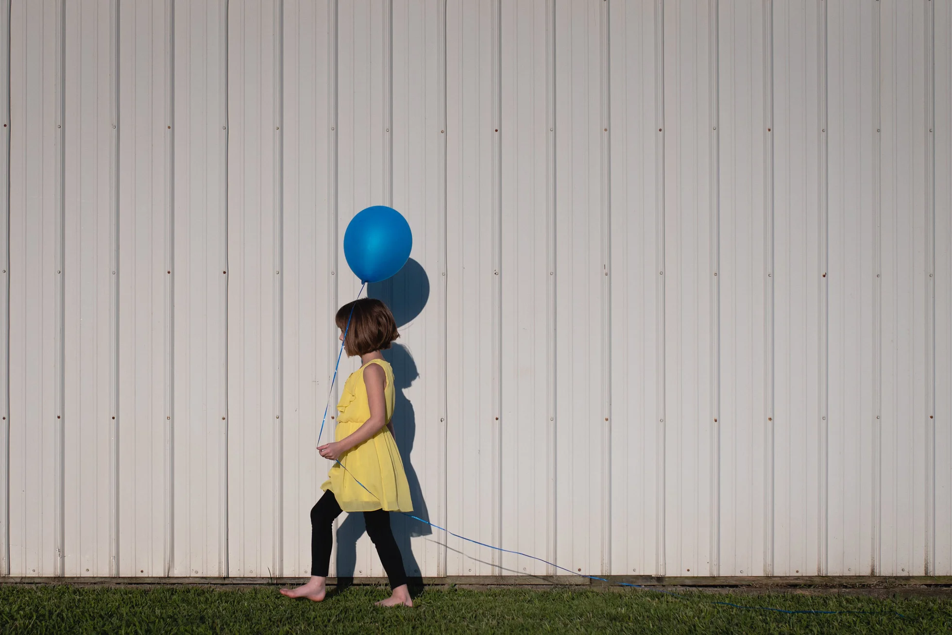
Isolate the subject example, elements of composition, Columbus, Indiana photographer

6.       Color

Using analogous colors or complimentary colors will help bring attention to your subject.  For this picture the girl’s hoodie is the same color as the lemur’s eyes. Color harmonies are also very pleasing.  I love using the primary colors!

color example, rules of composition, tutorial, Columbus, IN photographer

7.    Fill the frame

This is where you get very close to your subject so that very little if any space is seen around them. This draws the attention right to your subject.  Cropping in very tightly works well for this, just make sure to not chop limbs in an unpleasing way.  For more information on limb chops go here.

Fill the frame, composition element, Columbus, Indiana Photographer

8.      Leading lines

This is exactly how it sounds.  Look for lines or paths that will lead your eyes to the subject. You want these lines to take your eyes deeper into the frame. They do not have to be straight, sometimes a curved path can take you deeper into the image.

Leading Lines example, Columbus, IN Photographer, Tutorial

9.      Foreground and Depth

This is essentially layering.  Having a strong foreground, middle ground and background can help add visual interest. In this picture the plant is the foreground, the baby is the middle ground and the grandmother is the background.
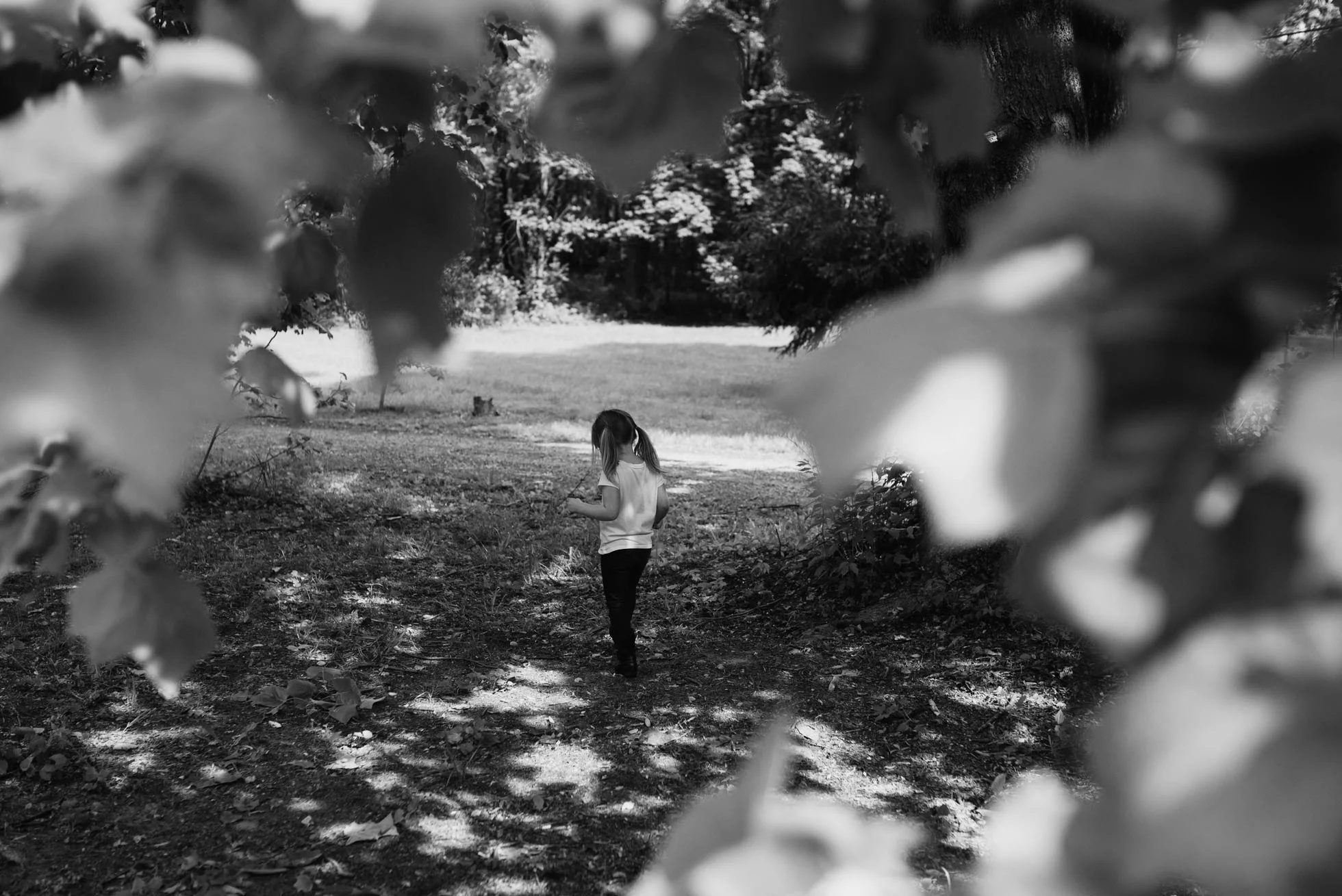
Foreground and depth, Composition example, Columbus, Indiana Photographer

10.      Framing

This one is my favorite! I love shooting through things to frame my subject.  In this case the leaves do the job.  But you can use anything! People, nature, buildings, even light! The possibilities are endless.

Framing example, Columbus, IN photographer, composition rules

Hope this is helpful! If you’ll like, you can read more here. Thanks for reading.

How To Do a Simple Composite

Here is my photograph that I am going to use to be the center of my composition.

Cabin, black and white picture for Photoshop Composite, Columbus, Indiana

I start out by using the quick selection tool to select the cabin and some of the ground. I then copy and paste it to a new document in Photoshop. (I just use a generic size and then extend my canvas with the crop tool).  Next step it is cleaning up the image.  You can use the erase tool, or you use a layer mask to tidy up those edges and get rid of anything extra the quick selection tool may have selected.

Photoshop edit, How to do a Composite, Columbus, IN

I then add more ground by selecting some from other pictures I took from the same shoot. Keep the edges of everything soft by using the blur tool or use a soft brush on a layer mask. Next, I add the sky and use a black and white layer to make everything black and white.  In this picture I used a cloud layer from Jessica Drossin’s Macabre skies and overlays.   However, you can use one of your own if you have one! To make sure the light is coming from the same direction in my clouds as it is in my cabin picture I flip the sky horizontally (which may not be necessary in your image) and then add a gradient fill layer (white to black) to change the light. I changed this to layer to soft light and adjusted the opacity to my liking (28%).

How to do a composite photoshop tutorial, Columbus, Indiana

Next, I added a smoke layer for the chimney mostly to add more drama! The smoke layers also come in Jessica Drossin’s Macabre Skies and overlays package. Then I add some more smoke/fog to the bottom using another overlay.  You can also create a fog brush. Phlearn has a very handy tutorial here.

Screen shot for tutorial example, smoke overlays, Photoshop tutorial, Columbus In

Then I notice the ground in front of the cabin is a little too bright.  So, I simply paint over it with a soft black brush (on a new layer).  I then set it to soft light and adjust the capacity to my liking (54%). Then I add a stamp visible layer (which is all the layers put into one new layer) by using the short cut Ctrl+Alt+shift+E (on a PC).  I then went to Filter + noise + add noise.  I selected Uniform at 1.05% - Then I set that layer to soft light and adjusted the opacity down to 38%. This just brings everything together in a more cohesive way.  

Photoshop Tutorial, how to do a composite, Callihan Photography, Blog, Columbus, Indiana

I then darkened part of the entire image and added contrast using dim the lights action (which comes with Jessica Drossin’s Macabre Skies Package).  This is a Gradient Map layer, but you could just add a brightness and contrast layer to do roughly the same thing. After this I just cleaned some of it up using the clone tool, and blurring parts of the image.  (Blurring can trick your eyes into thinking something belongs in the image when it doesn’t.) And then you have my final image here:  

Final Image, Callihan Photography, Columbus, Indiana