How to Light Paint in Photography

Light painting is something I have begun to experiment with lately! I just think it is so fun and unique. Light painting is fairly simple, and just requires some trial and error.

light painting by callihan photography

What you will need:

In addition to your camera you will need a tripod.  A tripod is absolutely necessary if you want crisp clear images.  Another thing you might want to try is using an off-camera flash.  You will also need a completely dark setting. No ambient light in the room at all, or it will show up in your picture. (which is another option-see below).   

Settings:

Start with a low ISO around 100-500. Then adjust your aperture.  If this is a self portrait it is best to close down and have a higher f-stop.  This will give you a wider range of focus. Next step is to pick your shutter speed.  Depending on what kind of light painting you are doing you can go anywhere from 1 second to about 30 or 60 seconds.  If you want a lot of light painting and you have a separate subject, I have found the best setting is bulb, and then you can hold open your shutter as long as you’d like.  Try out your settings and adjust accordingly. 

light-painting-and-dancing

Experiments:

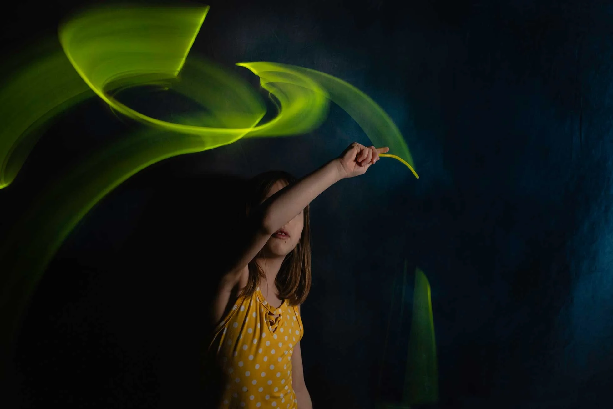
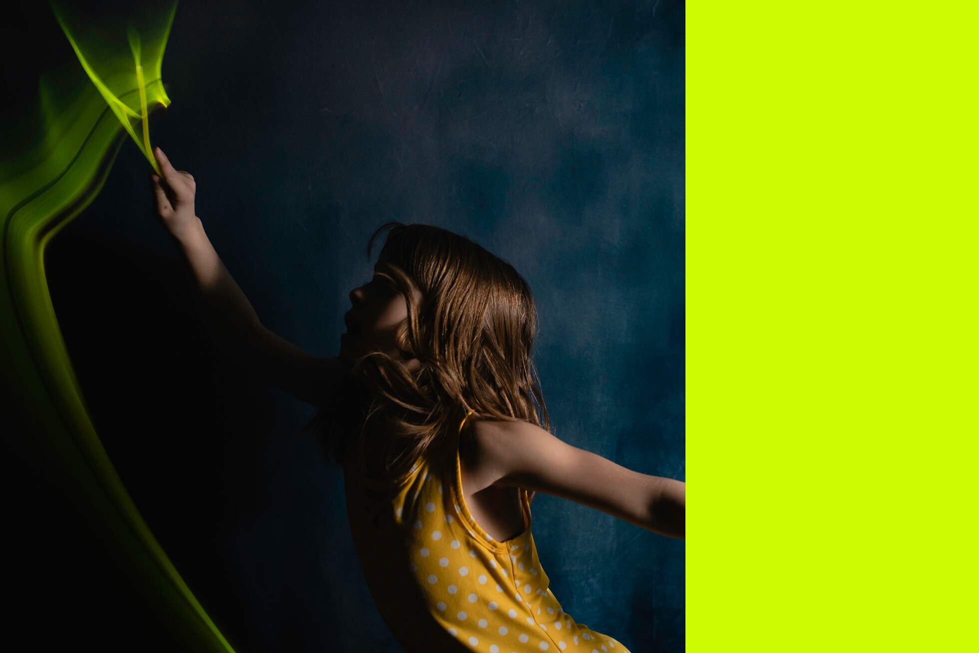
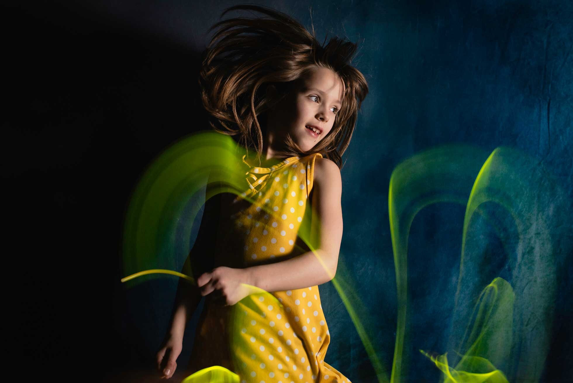
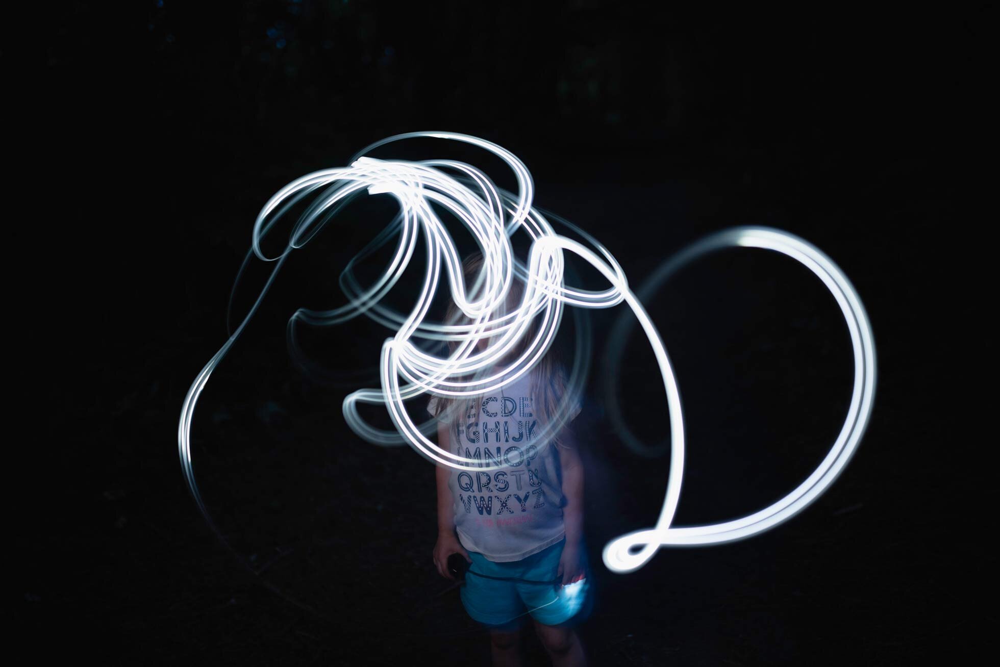
To freeze motion, you can use flash.  For the following pictures I used an off-camera flash and set it to go off once.  (If you have a fancy camera and flash you can set it to go off multiple times which will freeze your subject many times in one frame.)  I then had my subject walk around with glow sticks, or wave them around.  Consider where you are painting.  Make sure you are not putting the light right where your face would show up in the picture. (Unless you want that.)  For me, I wanted the face to be the focus.  Depending on how long you keep your shutter open for will affect how much light you will be taking in. I have found moving the light slowly also makes the light trail much brighter than if you move around quickly.

Slower Light Painting Image:

Jumping-and-light-painting

Faster Light Painting Image:

light-painting

I had to hold the shutter speed open longer for the bottom one, and it is a much more blurry light trail than the previous image.

For this next two pictures I set my camera up for 1- 2 second shutter speed.  This is a self-portrait, so I used the self-timer on my camera.  I also left a lamp on a few feet away from me so that my camera would pick up the ambient light. This effect is much blurrier.  The light was pretty orange because my lamp gave off that color. I love it against the blue background.  

motion blur
Being-pulled-in-a-different-direction-motion-blur

Types of light you can use:

You can use any type you want! For this image below I used my book light.  I have also used glow sticks, and sparklers.  You can use a flashlight, or phone light. Try out lots of things! Please feel free to share your light painting images with me! I’d love to see them! Light painting is such a fun experiment.  Here are a few other sources to reference for more information about light painting:  

https://petapixel.com/2016/07/25/basic-guide-light-painting-photography/

https://ericpare.com/light-painting-tutorials

https://digital-photography-school.com/light-painting-part-one-the-photography/

how-to-light-paint

Thanks for reading!


How to Replace a Sky in Photoshop

I have often found myself thinking, “this photo is really missing something”.  I have developed my own little method of replacing skies, and you might do it this way too! Either way keep reading! You might ask, why would you bother replacing the sky? Because, there are just some pictures that look better with clouds! Some photos need a little extra punch. Whether the sky was clear that day (like in my example) or you’ve blown it out trying to expose for your subject, I will show you my own method for replacing that sky in Photoshop.  Here are some before and after pictures where I have replaced the sky:

Before

Before

After

After

Before

Before

After

After

Before

Before

After

After

Before

Before

After

After

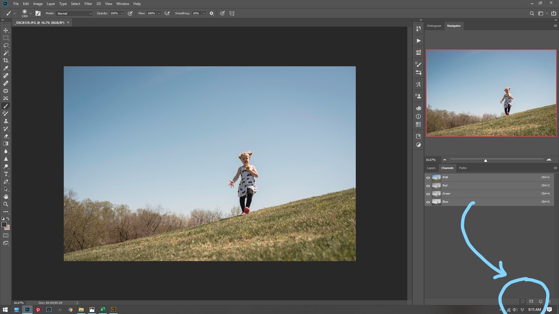
Now for my process.  First, bring your photo into Photoshop.  After making all your basic adjustments observe what kind of light is in your photo.  Is it hard light? Is it soft? Is it back light, or side light or midday light? In this photo you can see that it is midday and very hard light.  So obviously a back light sunset is not going to work for this photo.  I chose a cloud overlay from Jessica Drossin, but you can even use your own if you want!  Go ahead and bring the overlay into your work space on Photoshop. Place the clouds where you think they would look the best.  Then turn off your new cloud overlay layer by clicking the eyeball next to the layer.  Then go to channels.  Select all your channels by clicking the RGB channel.  Now drag your RGB channel to the little marching ants circle at the bottom right of your screen.  Like this:

Callihan Photography in Columbus Indiana
Columbus, Indiana

Now go back to your layers and turn back on your cloud overlay.  Then click the masking tool to add a mask, seen here:

Callihan Photography in Columbus, Indiana

After that it should look something like this:

Columbus, Indiana

Now this is the part where you panic and say, “WHAT HAVE I DONE!!!!” It’s OK.  Do not panic.  It’s going to look a little weird.  At this point, by masking the channels it has given you a good start.  The rest is going to be by hand.  Paint in your masking layer with a soft black brush at 100%.  Make sure to cover all your subject’s skin and hair and the ground.  Make sure there are no hard edges where your overlay ends. Use different opacity brushes to get around your subject if needed.  

Columbus, Indiana photographer

Next is just fine tuning.  Sometimes the sky needs lightened. So, I usually lower the opacity to make it blend better.  Sometimes, it will need more contrast.  Sometimes you will need to darken your subject to make it look right. I usually use a curves adjustment layer to do this. In this example I felt like it needed more contrast. So, I added a contrast and vibrance layer (as I felt it was getting a little desaturated).  

Columbus, Indiana local photographer

Here is the before and after of my example image:

Before

Before

After

After

This WILL NOT WORK EVERY TIME.  Sometimes you have a picture that you just can’t make this kind of selection.  Or sometimes it just looks weird.  Sometimes you need to try out a few different skies.  Whatever the case is, this is the best way I know how to select around your subject and blend the sky into all those tree branches.  Please give this a try!! And if you do, please share it with me!! I’d love to see what you’ve done! Thanks for reading!

How to do a Levitation Photo

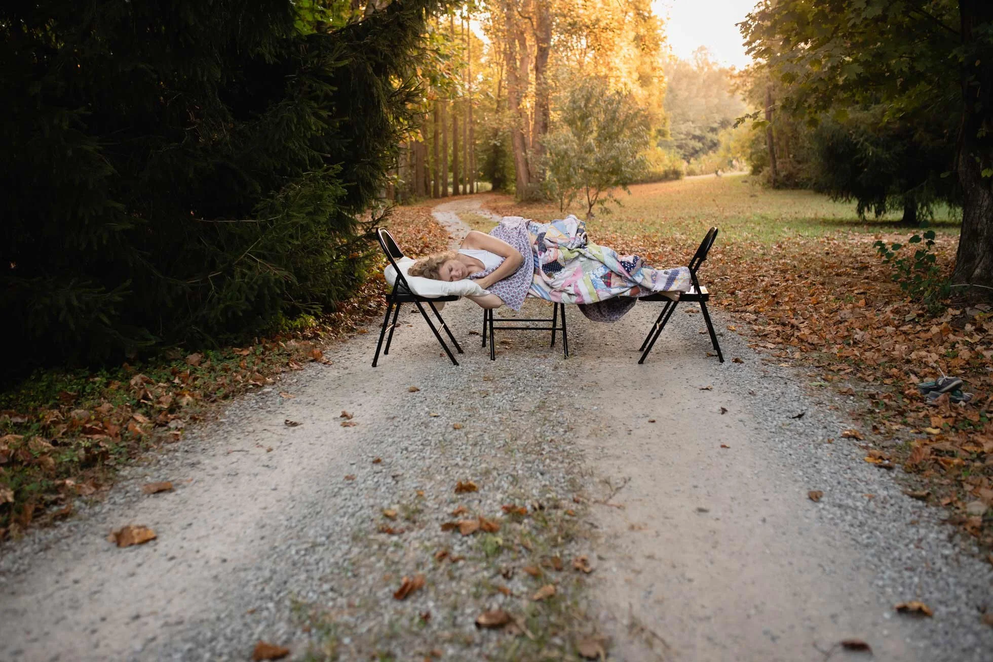
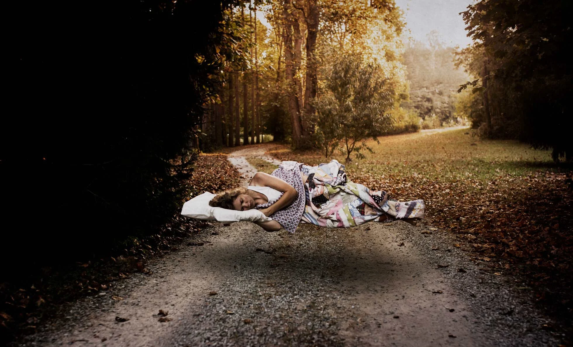
A levitation photo can add a bit of magic to your repertoire! For me, a bit of fine art photography is a nice break from doing regular clean portraits.  This is how I started out doing photography! And it is fun to experiment with.  For this example, I went out early in the morning (which is just a terrible idea for a night person like myself) and took a photo rather quickly.  Since I knew what I wanted to do with this photo it was easy to set up.  I wanted to do a dream like image where I was sleeping and levitating. So, I set up my 3 chairs with my pillow on one end.  I used live view on my camera, set my focus and set the self-timer.  Then I took about 4 photos at a time. Here is my original photo with the chairs:

Levitation image, Callihan photography, columbus, Indiana

Then I took a photo of my pillow.  And then I took a photo of the scene without the chairs.  I made my basic edits in light room and cleaned up things like my shoes sitting off to the side.  Then I brought my three pictures into Photoshop.

the road less traveled, callihan photography, columbus, IN
levitation pillow example, Columbus, IN, callihan photography

I then used the picture without the chairs as my base.  I then selected myself and the chairs and copy and pasted on a new layer. 

callihan photography, columbus, indiana fine art photography

Using a hard brush, I removed the chairs by painting black on a white mask for that layer. I was then stuck with the chair cutting into my pillow.  So, I took the pillow from the other picture, selected it and pasted it on a new layer. I then used this layer to cover up the black chair on the pillow.

columbus, indiana, callihan photography, screen shot

At this point I needed to make the shadow underneath me.  Without the shadow I just looked weirdly lying on the ground.  This is where you need to take note of your light.  Is it soft or hard? Do you have a hard shadow or a soft one? Is there a multiple light source or just one?  As you can see in my picture with the chairs, I have a very soft faint shadow underneath me and I need to recreate that. So, I then made a duplicate layer of myself (without the chairs) and hit CTRL+M for the curves layer.  I blacked it out by pulling the highlights all the way down.  I then used gaussian blur to blur the shadow even more.  Then by using the short cut CTRL+T to transform (and simultaneously clicking the mouse on a corner square and holding down the CTRL key) I skewed the perspective of my shadow to flatten it a bit more.  I then placed it underneath my floating body and set my opacity to 45%.  (The 45% is just what I thought looked about right).  

callihan photography, screen shot, columbus, indiana photographer

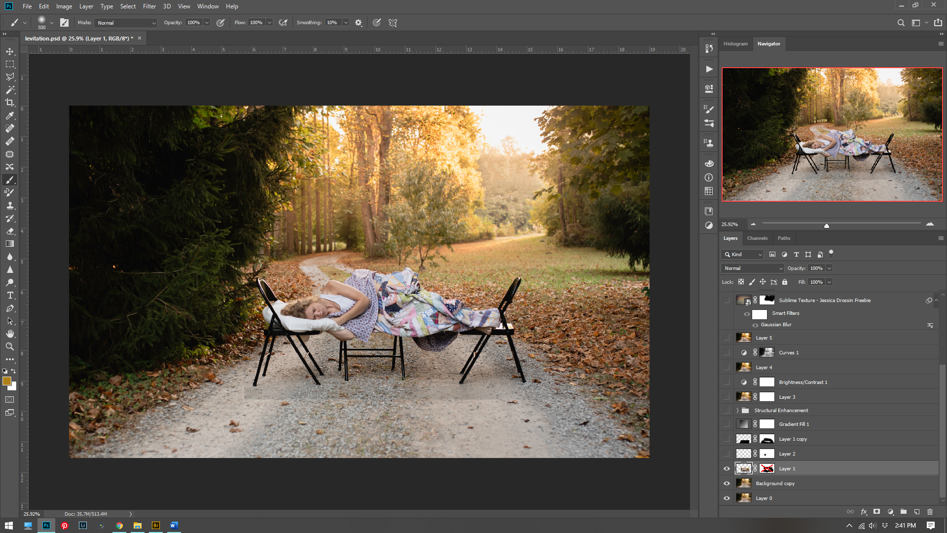
At this point it is all artistic license. I enhanced the light to make it a bit hazier. I did this by adding a radial gradient layer. I increased the contrast. I added a texture from I bought from Jessica Drossin. Then I thought it looked a little too yellow and intense and I wanted to give it a more painterly T.C. Steele tone to it.   So I added a hue/saturation layer. 

columbus, indiana photographer, callihan photography, Adobe Photoshop screen shot example

I then thought it looked a little dark so I added a curves layer adjustment.  Two more texture layers from Jessica Drossin to add that painterly texture and feel. (Sometimes adding a texture can make an image come together).  Then I added another Hue/saturation layer to tone some of the yellow out.  Here is my final image:

levitation photo, columbus indiana photographer. callihan photography

If you want to see more fine art images, I highly recommend taking a look at Brooke Shaden.  She does some amazing work! Thanks for reading!