How to Give a Critique

Wow. Let’s just say if you go on the internet at all you will be bombarded by people improperly giving critique.  Critiquing can be so helpful and really aid you in growing as a creator.  It is absolutely necessary to put your work in front of those you trust to gain a new perspective on your work. I know this might be a sensitive topic for some so please allow me to gently offer some thoughts and rules to giving someone a critique.

how-to-give-a-critique-for-art.jpg

1. Don’t give one unless the creator asks for one.

I feel like this is so obvious, but some people feel entitled to give their opinion without anyone actually asking for it.  If you are guilty of this it is completely understandable.  Once you’ve learned a new skill yourself, you want so desperately to pass it on to others.  So perhaps your critique comes from a good place.  However, you have the power as a critic to destroy that joy someone gets from creating.  Consider that with the weight it deserves.  Think of when you were just starting out, and how you were just trying to discover how things worked. Think of the fun you had from just the creative process!  Now think of a time when you shared your creation, and someone ripped it apart. How did you feel? Were you completely defeated? Was that critique offered taken in a constructive and helpful way or did you just want to give up.  It is so easy to dehumanize someone, especially on the internet. Remember that your words have power!

2.  The Feedback Sandwich

Look and think about what you want to say and check the tone in which you deliver this feedback.  Point out the positive things that you think were executed well.  If you can’t come up with anything positive, it’s best to just keep your mouth shut. If you don’t have anything nice to say then don’t say anything at all.  Most of the time you will be able to come up with something positive to say to encourage the creator.  Remember, you want to build them up, not tear them down.  Once you’ve offered some things you think they’ve executed well, then offer specific things they could have improved upon. Making it specific will give the creator something tangible to work on.  Improvement is actually possible at this point and you as the critic aren’t just being hateful.  Next, add something positive again and encourage them to keep working to be even better at their craft.  This will help your feedback to be well received and valued.

3. Check Your Motives

This is really a summary of the other two points.  It goes back to- are you being asked for a critique and is it your goal to help the other person or not?  It’s easy to be prideful when giving a critique.  It’s easy to elevate yourself over this other person who is asking you for your opinion.  It’s easy to tear someone else down to make yourself feel better.  Giving a critique should be helpful and not harmful.  If it is not your intent to be helpful, then it is best to refrain from offering your opinion.   

A Note About Receiving A Critique:

Now when you receive a critique it is easy to be hurt.  This is especially true if your expectations are not met. We as creators put our heart and soul into our art.  Before you react to your critique give it some time.  Just sit with it for a while.  Ask yourself why you are hurt? Was it personal?  Are you so emotionally attached to what you created that you cannot stand back from it and receive a critique?  If you cannot be objective, then you need to step away from it for a while.  Breaks are OK! The first few times you receive a critique are hard, but you do get used to it over time.  And both giving and receiving critique will help you hone your craft! So, get out there and find a group you trust.  Before you know it, you will be improving by leaps and bounds.

How-to-give-critique.jpg

I hope you find this helpful!  I think there are some solid principles in here that you can apply to whatever your hobby (or your friend’s hobbies) might be.  Thanks for reading!       
How to do a Double Exposure

What is a double exposure? It is a technique that layers two different exposures on a single image, combining two photographs into one. 

There are 3 different ways to do a double exposure.  The first is with a digital camera.  You can achieve this in camera.  For Nikon you would go to the photo shooting menu (which is the camera icon in your menu).  From there you would select the multiple exposure mode.  Arrow down to select the number of shots you want to combine.  Then select multiple exposure and arrow through to turn on for a single photo or series.  When you take your first photo there will be a symbol of overlapping squares at the top of your photo on the LCD screen.  Then take another and it will combine them for you!  For me personally, I have added this multiple exposure option to the “my menu” feature on my Nikon D750.  That way it is easily accessible.  On a Canon it is very similar.  You would use the dial to turn across to “multiple exposure” and click “set.” You will then have several sub menus options.  This article here explains better on how to do it on a Canon.

double-exposure-black-and-white.jpg

The second option is if you shoot film.  Some film cameras allow you to do this, and some do not.  With film I believe you generally try to overexpose, but with double exposures it is best to underexpose.  It might take some getting used to. To create the double exposure, you will want to expose the same frame more than one time. Google it to see if your film camera has this capability and read more about shooting double exposures on film here.

Senior-session-double-exposure-by-callihan-photography.jpg
weeds-and-portrait-double-exposure.jpg

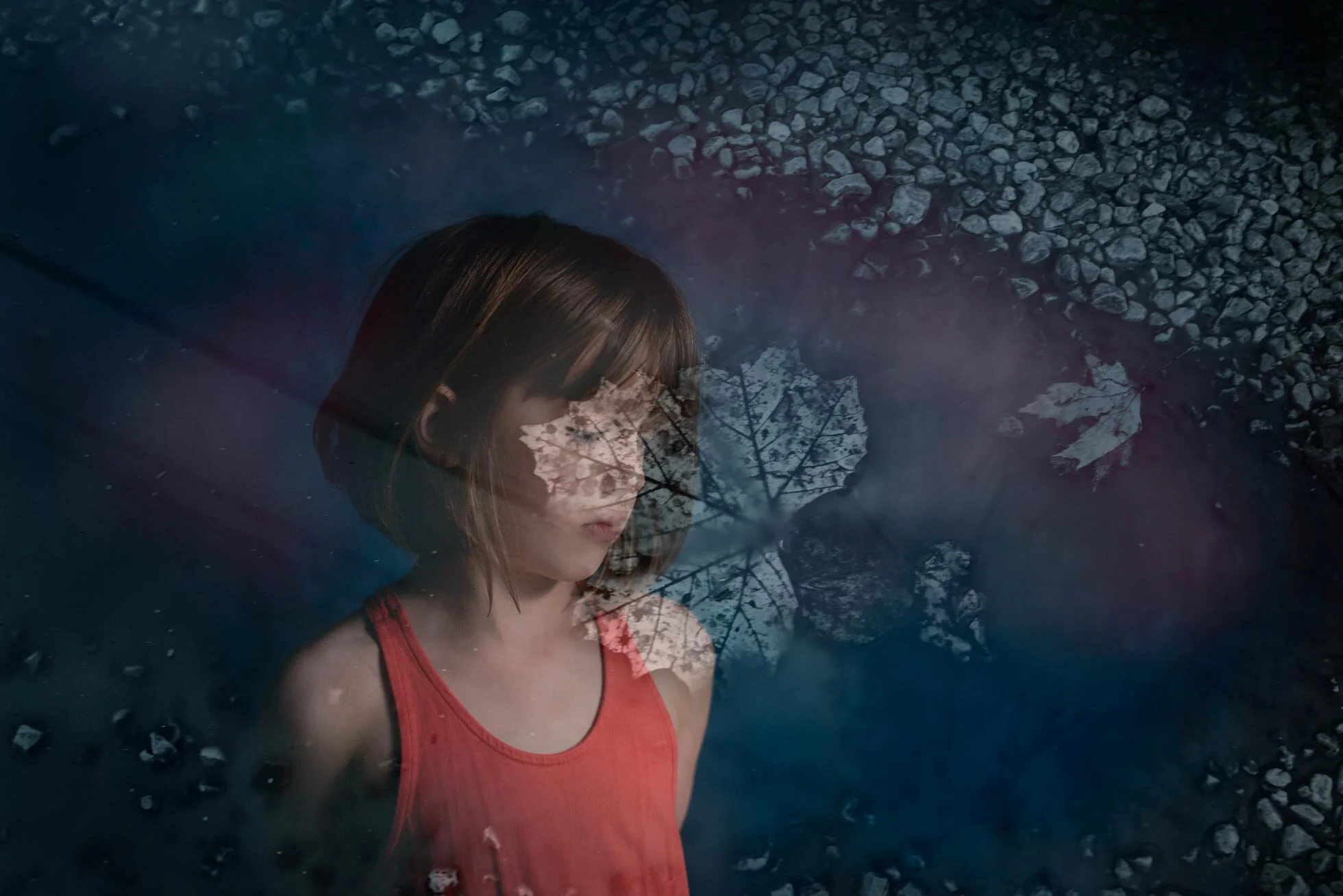
The third way is to do it in Photoshop. Choose the photos that you think will layer nicely.  For my example I have used a puddle with a leaf in it and a portrait. Open them in Photoshop and put one layer over the other.  Then adjust the opacity. I have then masked off the areas of her face that I want to show through and have more detail. I did this by adding a layer mask to my overlaying puddle photo.  I then paint with a soft black brush to let the lower portrait layer show through. I then brought in more color by adding a blue gradient layer.  I then masked off the areas I didn’t want the gradient layer to affect.  I then added some paint on a new layer to add depth and more of the orange color.  I set it to pin light according to my preference and lowered the opacity. And there you have it! Adobe has a great tutorial here.  

callihan-photography-photoshop-double-exposure.jpg

It’s easy to do, but to be successful compositionally it can be quite difficult.  With a double exposure the shadows of your first frame will be filled in by the light parts of your second frame.  So, it’s best to try to visualize what you want it to look like.  Though it can be very hit and miss.  It’s something worth experimenting with. Sometimes overexposing or underexposing can help you clearly define the double exposure. If you want to see an outline of your subject place your subject against a blank background.   

Senior-session-by-callihan-photo-double-exposure.jpg
flower-double-exposure-callihan-photography.jpg

Thanks for reading!

How to do a Levitation Photo

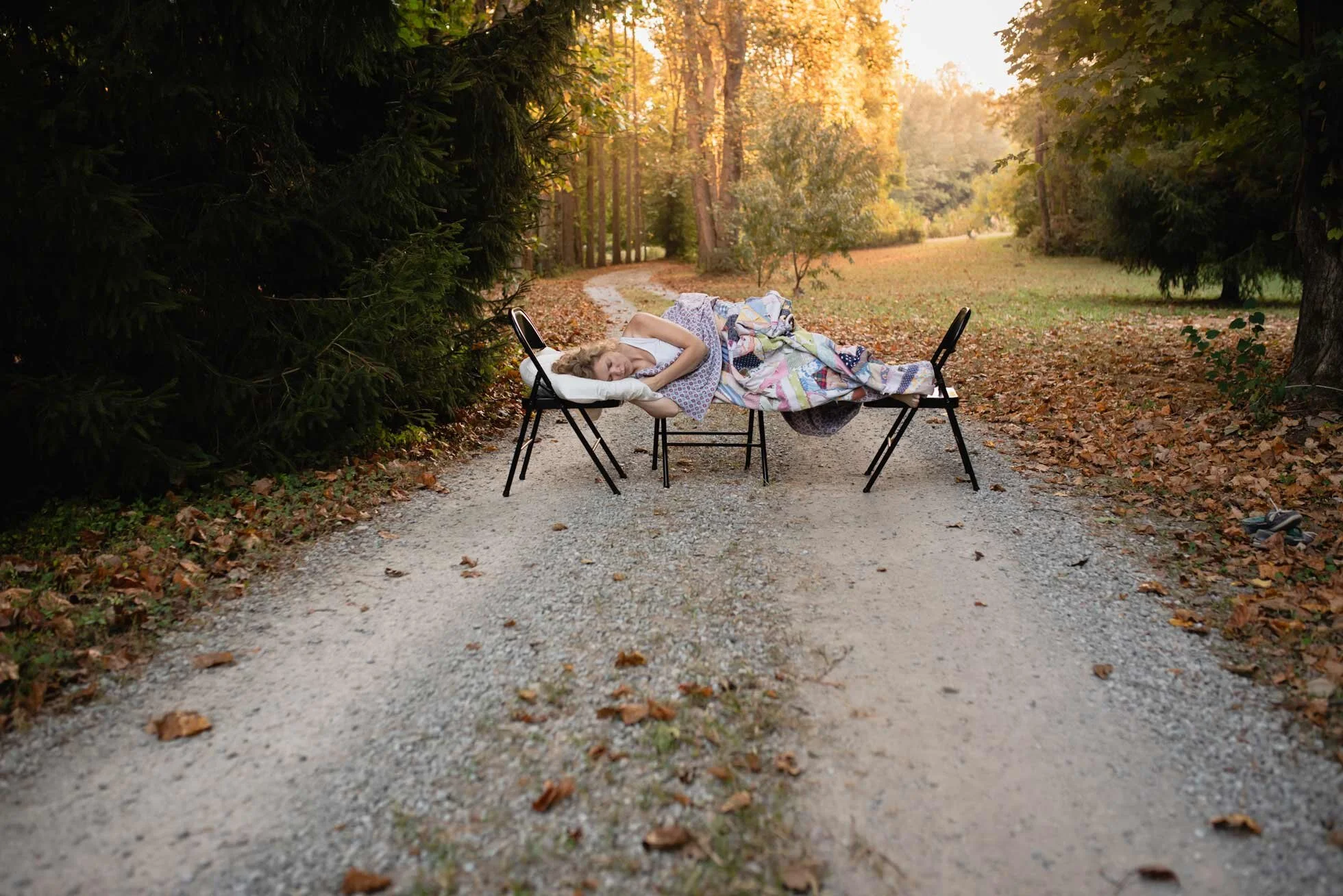
A levitation photo can add a bit of magic to your repertoire! For me, a bit of fine art photography is a nice break from doing regular clean portraits.  This is how I started out doing photography! And it is fun to experiment with.  For this example, I went out early in the morning (which is just a terrible idea for a night person like myself) and took a photo rather quickly.  Since I knew what I wanted to do with this photo it was easy to set up.  I wanted to do a dream like image where I was sleeping and levitating. So, I set up my 3 chairs with my pillow on one end.  I used live view on my camera, set my focus and set the self-timer.  Then I took about 4 photos at a time. Here is my original photo with the chairs:

Levitation image, Callihan photography, columbus, Indiana

Then I took a photo of my pillow.  And then I took a photo of the scene without the chairs.  I made my basic edits in light room and cleaned up things like my shoes sitting off to the side.  Then I brought my three pictures into Photoshop.

the road less traveled, callihan photography, columbus, IN
levitation pillow example, Columbus, IN, callihan photography

I then used the picture without the chairs as my base.  I then selected myself and the chairs and copy and pasted on a new layer. 

callihan photography, columbus, indiana fine art photography

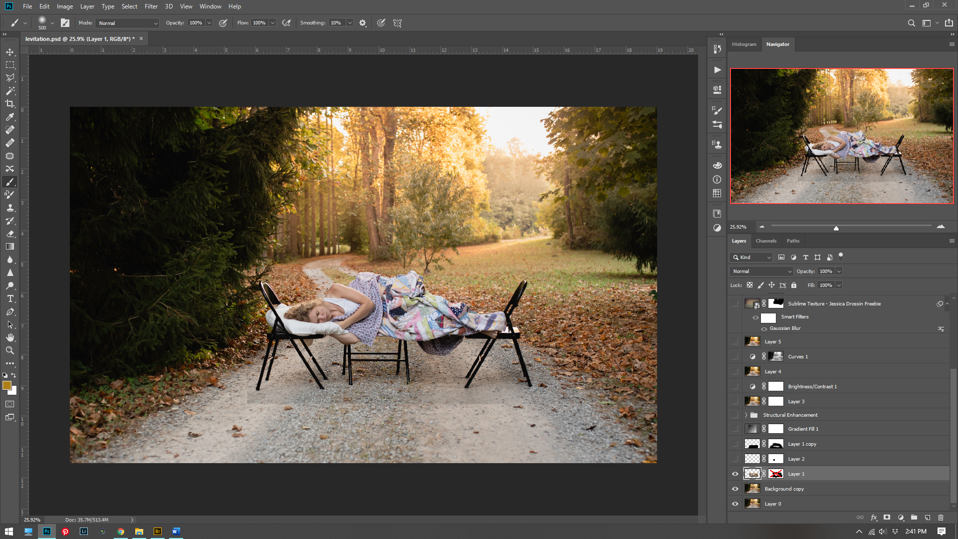
Using a hard brush, I removed the chairs by painting black on a white mask for that layer. I was then stuck with the chair cutting into my pillow.  So, I took the pillow from the other picture, selected it and pasted it on a new layer. I then used this layer to cover up the black chair on the pillow.

columbus, indiana, callihan photography, screen shot

At this point I needed to make the shadow underneath me.  Without the shadow I just looked weirdly lying on the ground.  This is where you need to take note of your light.  Is it soft or hard? Do you have a hard shadow or a soft one? Is there a multiple light source or just one?  As you can see in my picture with the chairs, I have a very soft faint shadow underneath me and I need to recreate that. So, I then made a duplicate layer of myself (without the chairs) and hit CTRL+M for the curves layer.  I blacked it out by pulling the highlights all the way down.  I then used gaussian blur to blur the shadow even more.  Then by using the short cut CTRL+T to transform (and simultaneously clicking the mouse on a corner square and holding down the CTRL key) I skewed the perspective of my shadow to flatten it a bit more.  I then placed it underneath my floating body and set my opacity to 45%.  (The 45% is just what I thought looked about right).  

callihan photography, screen shot, columbus, indiana photographer

At this point it is all artistic license. I enhanced the light to make it a bit hazier. I did this by adding a radial gradient layer. I increased the contrast. I added a texture from I bought from Jessica Drossin. Then I thought it looked a little too yellow and intense and I wanted to give it a more painterly T.C. Steele tone to it.   So I added a hue/saturation layer. 

columbus, indiana photographer, callihan photography, Adobe Photoshop screen shot example

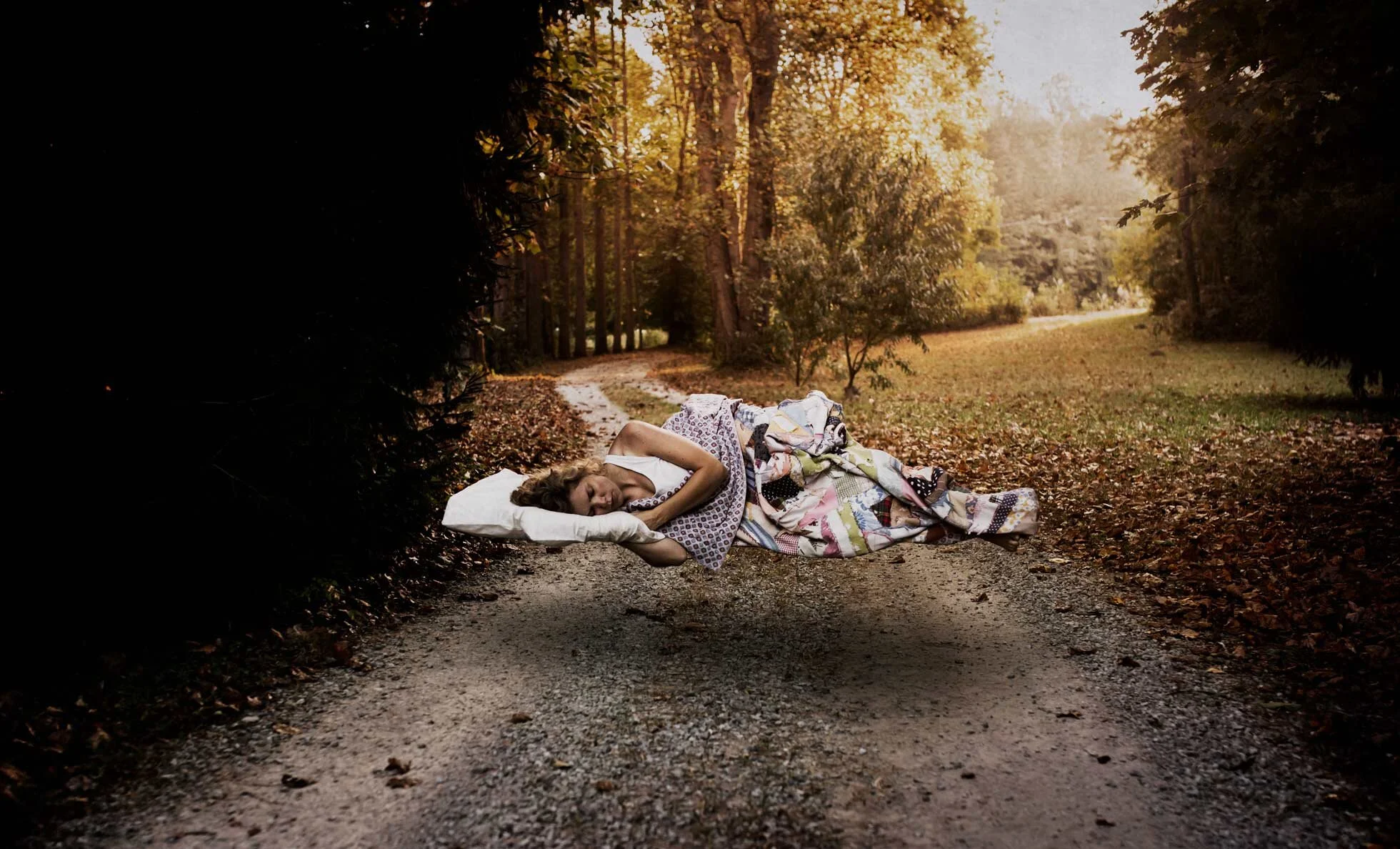
I then thought it looked a little dark so I added a curves layer adjustment.  Two more texture layers from Jessica Drossin to add that painterly texture and feel. (Sometimes adding a texture can make an image come together).  Then I added another Hue/saturation layer to tone some of the yellow out.  Here is my final image:

levitation photo, columbus indiana photographer. callihan photography

If you want to see more fine art images, I highly recommend taking a look at Brooke Shaden.  She does some amazing work! Thanks for reading!